Simplifying cancer information and providing access to care

Simplifying cancer information and providing access to care

The National Cancer Institute of Kenya (NCI-K) portal was created to tackle the challenge of finding reliable cancer information and facilities.

I led the visual design process and information architecture to simplify access to care resources, empowering patients with a centralised platform that connects them to healthcare providers and improves outcomes.

Industry

Healthcare

Healthcare

Role

Content Design
Product Design

Content Design
Product Design

Duration

Sept 2023-Oct 2023

Sept 2023-Oct 2023

Team

2 Product Managers
1 Designer
6 Developers

2 Product Managers
1 Designer
6 Developers

BACKGROUND

01

The state of the cancer burden in Kenya

The state of the cancer burden in Kenya

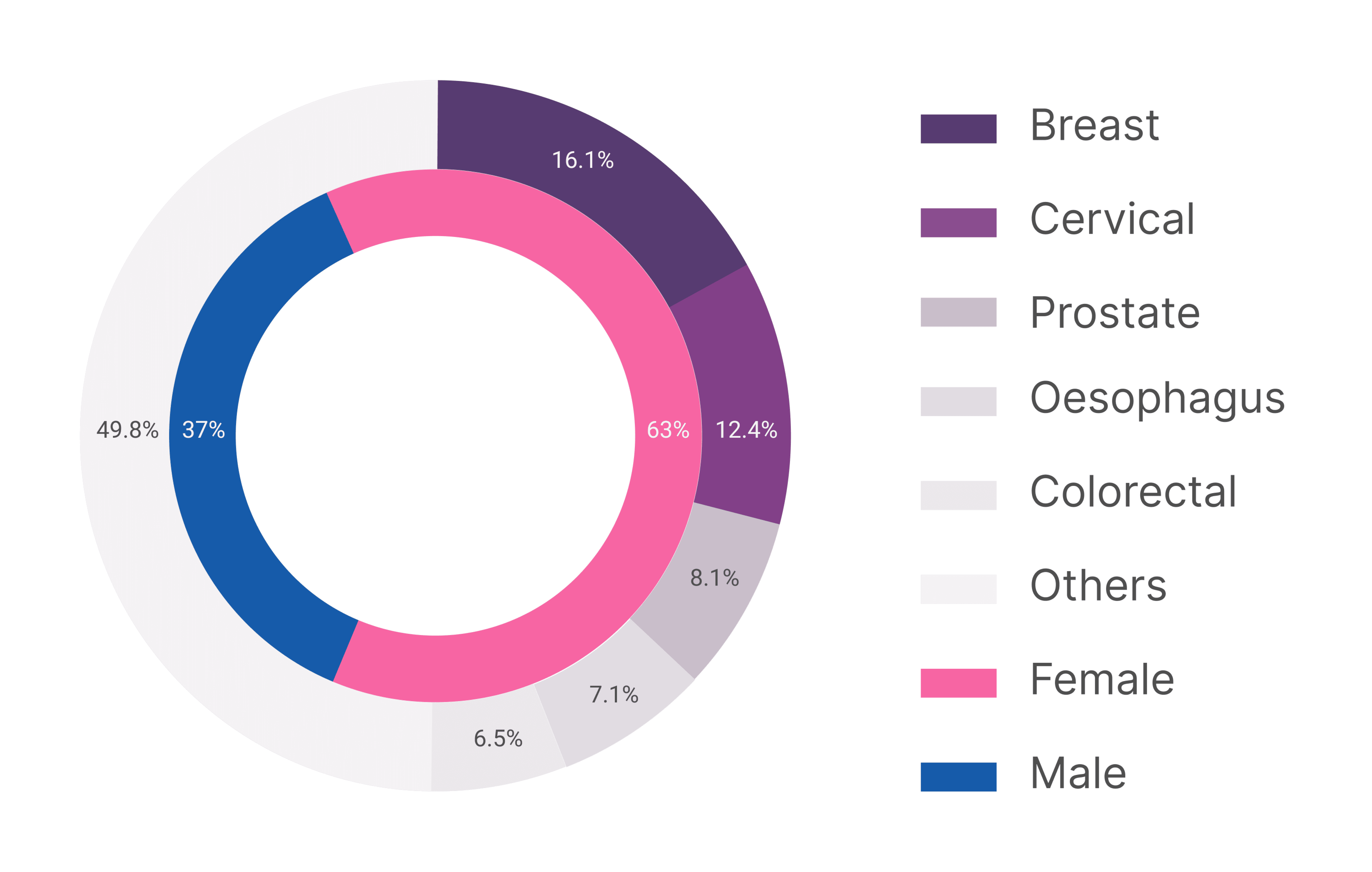
Kenya has seen a significant rise in cancer cases recently, making it the third leading cause of death in the country. Women are particularly affected, with breast and cervical cancers driving a high number of annual fatalities. This project aims to tackle the challenges fuelling this cancer crisis.

CHALLENGE

02

Finding reliable cancer information and facilities in Kenya can be a difficult task due to lack of access and localisation of content

Finding reliable cancer information and facilities in Kenya can be a difficult task due to lack of access and localisation of content

Most people don’t seek cancer care until it’s too late, often overwhelmed by unclear, non-localized content. Even when information is available online, it’s hard to understand or not in local languages. This keeps the public uninformed about prevention and results in low health-seeking behaviour. These barriers hinder early detection, crucial for effective treatment. While the existing NCI website aimed to address this, it struggled with interface issues.

Most people don’t seek cancer care until it’s too late, often overwhelmed by unclear, non-localized content. Even when information is available online, it’s hard to understand or not in local languages. This keeps the public uninformed about prevention and results in low health-seeking behaviour. These barriers hinder early detection, crucial for effective treatment. While the existing NCI website aimed to address this, it struggled with interface issues.

  1. Poor navigation

Vague category titles and a lack of navigation aids hindered users from quickly finding the resources they needed

Vague category titles and a lack of navigation aids hindered users from quickly finding the resources they needed


  1. Ineffective Thumbnails

Content preview thumbnails displayed actual content instead of serving as visual cues, lacking descriptions to guide user expectations

  1. Hidden Language Selection

The language selection dropdown was not easily noticeable due to its placement and styling.


  1. Visual Clutter

A chaotic mix of colors, poster arrangements, and font choices created a visually overwhelming experience

A chaotic mix of colors, poster arrangements, and font choices created a visually overwhelming experience


GOAL

03

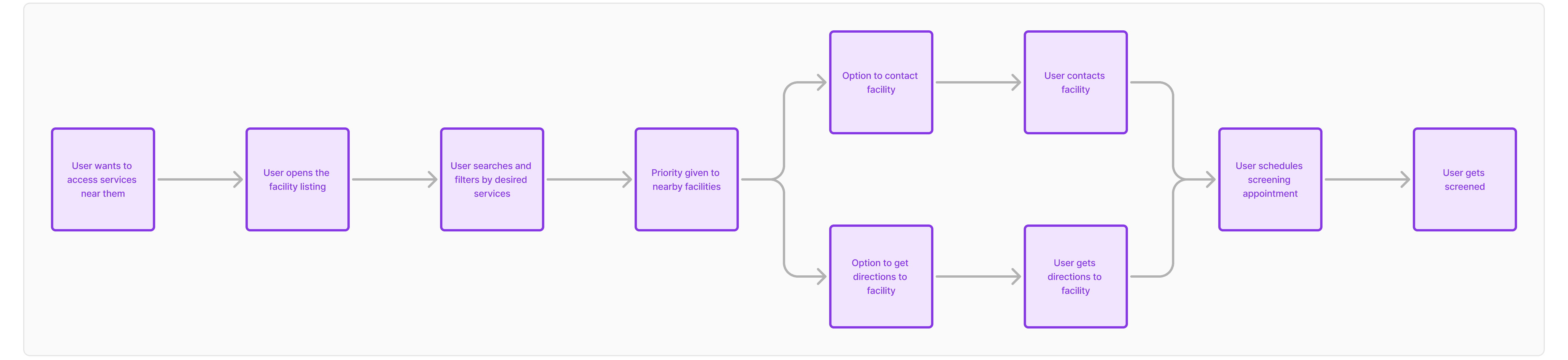
Our main goal was to create a platform that makes screening accessible to the general public by increasing awareness, promoting cancer prevention, and simplifying access to early treatment and care.

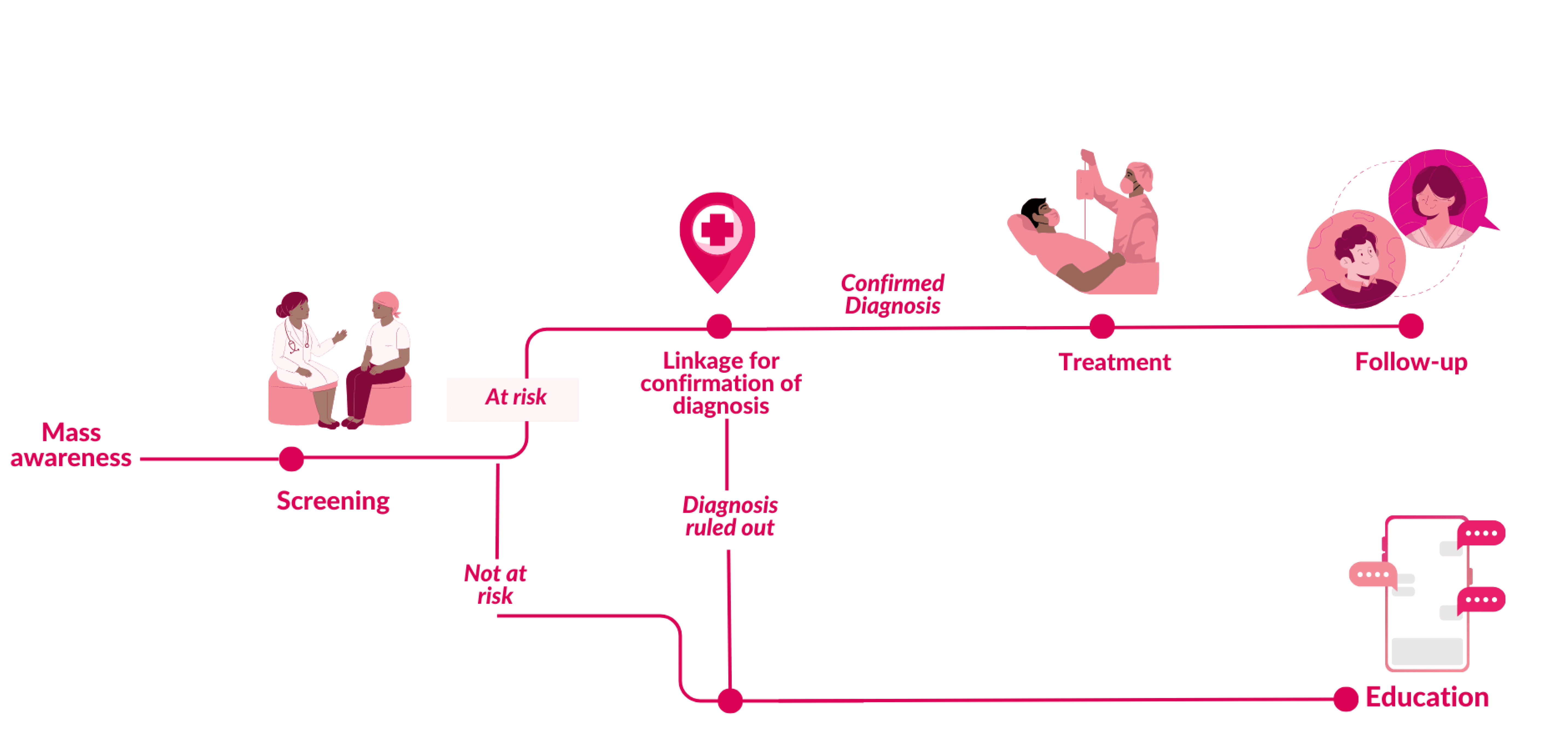
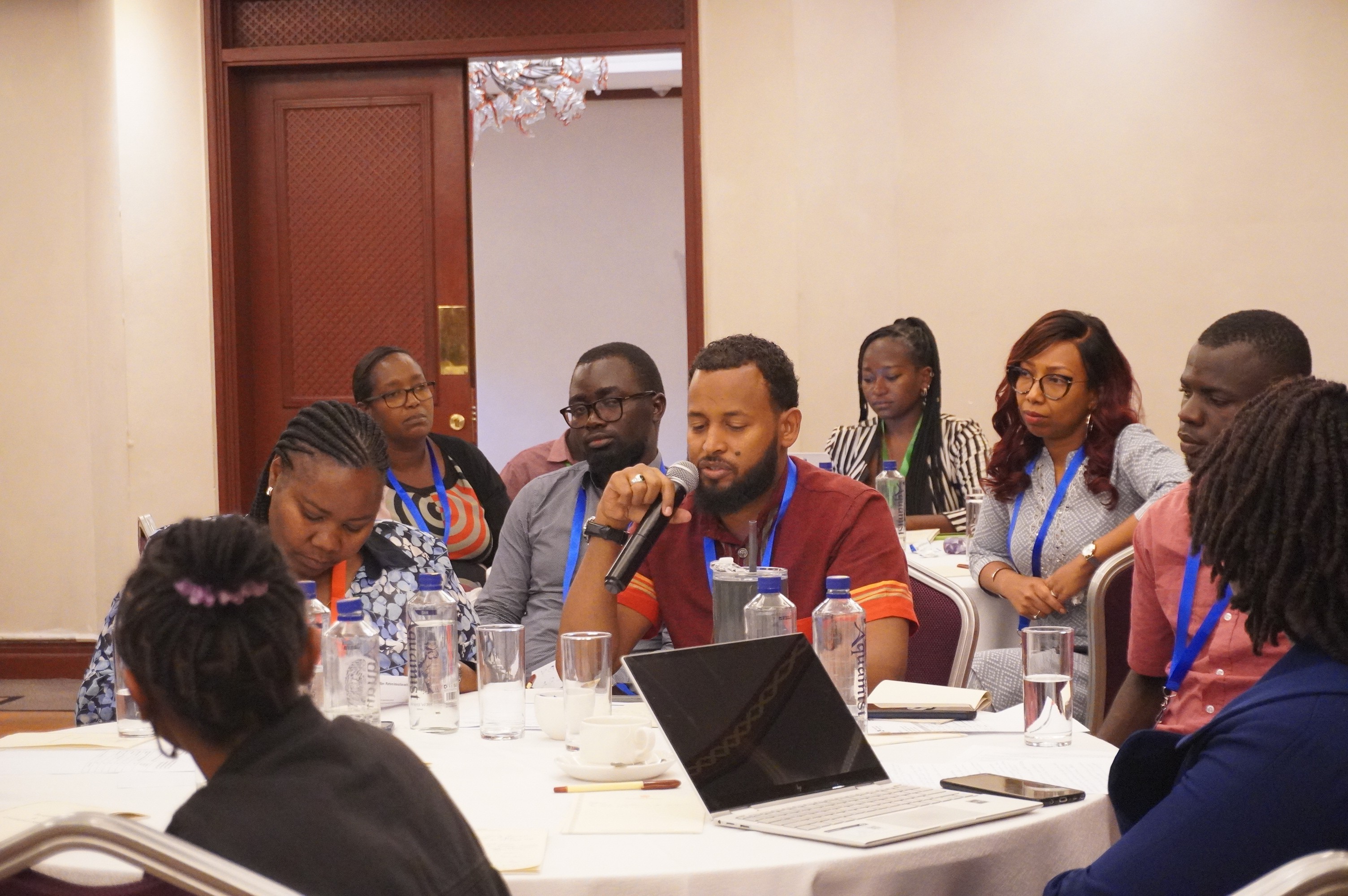
To lay a good foundation we began by engaging key stakeholders

Our research primarily involved workshops with key stakeholders, including oncologists, the National Cancer Institute of Kenya (NCI-K), and other implementing partners. Directly engaging with patients proved challenging due to limited access, leading us to rely heavily on stakeholder input.


The hospital environment presented unique challenges for conducting patient discovery sessions. We had to be mindful of patients' emotional and physical burdens and prioritise their well-being.

RESEARCH GOALS

Understand the cancer
patient journey

Understand the cancer
patient journey

Assess public awareness levels across various demographics

Assess public awareness levels across various demographics

Identify barriers to accessing care

Identify barriers to accessing care

BUSINESS GOALS

Encourage platform adoption and make it the single source of truth

Encourage platform adoption and make it the single source of truth

Improve public awareness and education on prevention and early detection

Improve public awareness and education on prevention and early detection

Build a Sustainable Health Ecosystem

Build a Sustainable Health Ecosystem

RESEARCH

04

Our research uncovered that it was quite evident that the pain points were centred around the following areas

Our research uncovered that it was quite evident that the pain points were centred around the following areas

Late-Stage Detection

Late-Stage Detection

Most people seek care only when symptoms become serious, reducing the effectiveness of treatment chances.

Most people seek care only when symptoms become serious, reducing the effectiveness of treatment chances.

Fragmented Healthcare Access

Fragmented Healthcare Access

Locating appropriate healthcare facilities is a major challenge, especially in remote areas.

Locating appropriate healthcare facilities is a major challenge, especially in remote areas.

Limited Health Information

Limited Health Information

Many users lacked information on cancer, how to prevent it and where to seek care,

Many users lacked information on cancer, how to prevent it and where to seek care,

Based on our research, we developed user journeys to visualise the patient experience and guide the design process

Based on our research, we developed user journeys to visualise the patient experience and guide the design process

IDEATION

04

We brainstormed screen layouts and mapped the patient journey to determine the optimal order of information. User engagement was prioritised, followed by seamless access to screening services.

We brainstormed screen layouts and mapped the patient journey to determine the optimal order of information. User engagement was prioritised, followed by seamless access to screening services.

Design Exploration

Design Exploration

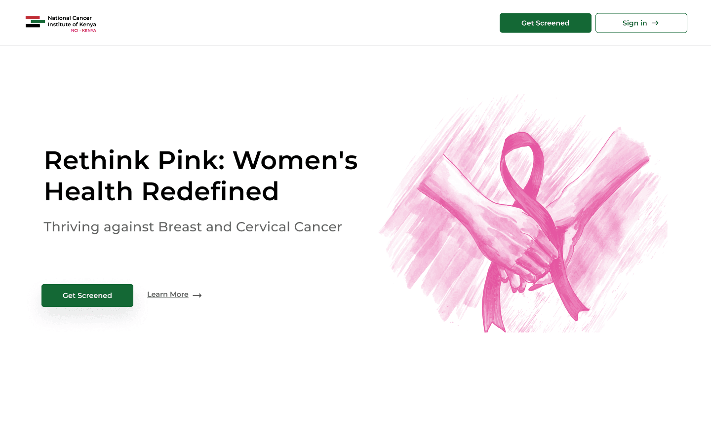
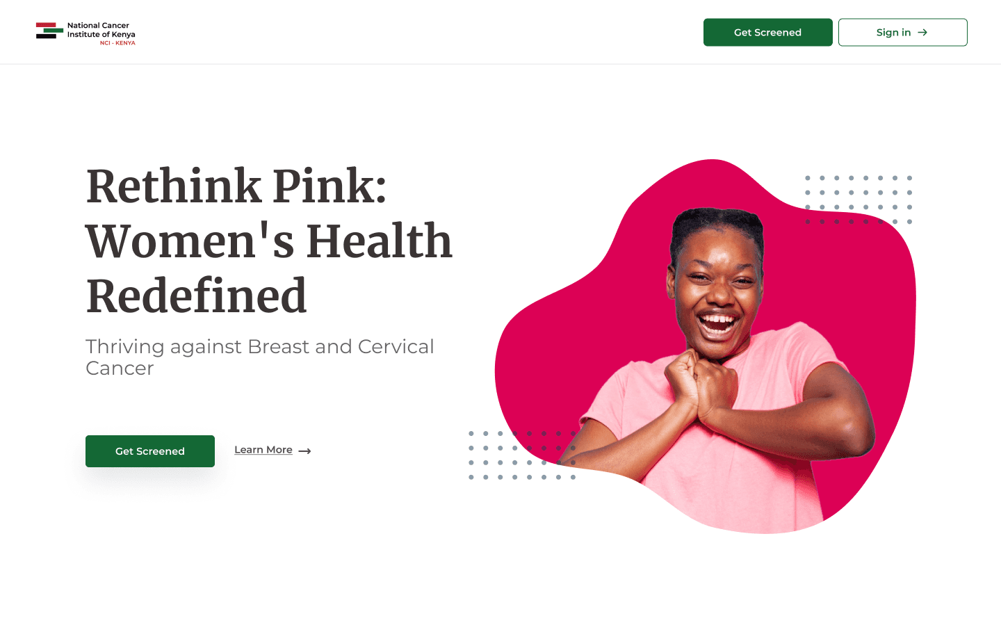
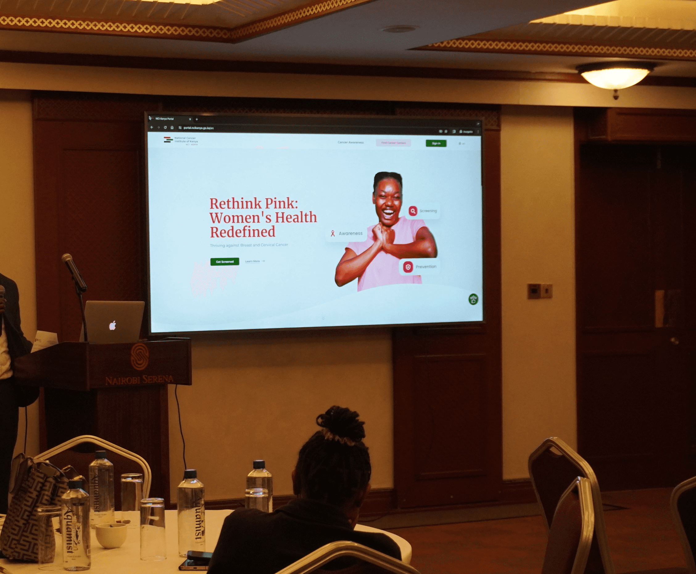
We looked into different ideas for the hero section. Since the portal was going live during breast cancer awareness month, we aimed to design it to reflect the theme.

This involved incorporating the colours associated with breast cancer and using imagery that resonates with women.
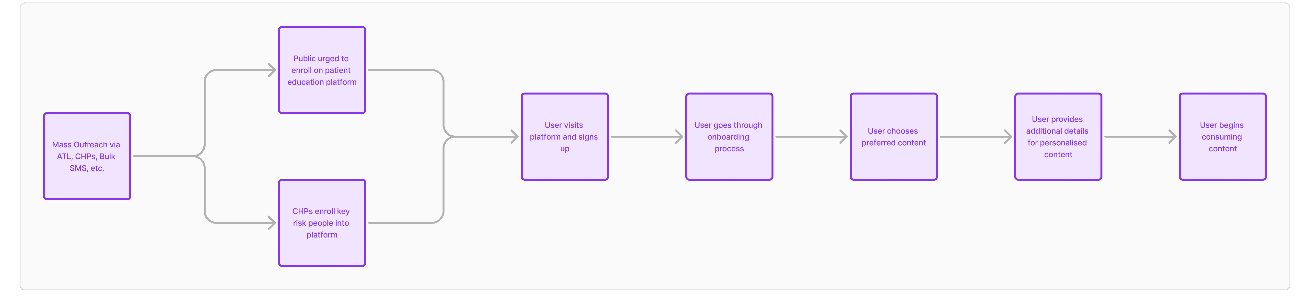
Features Used

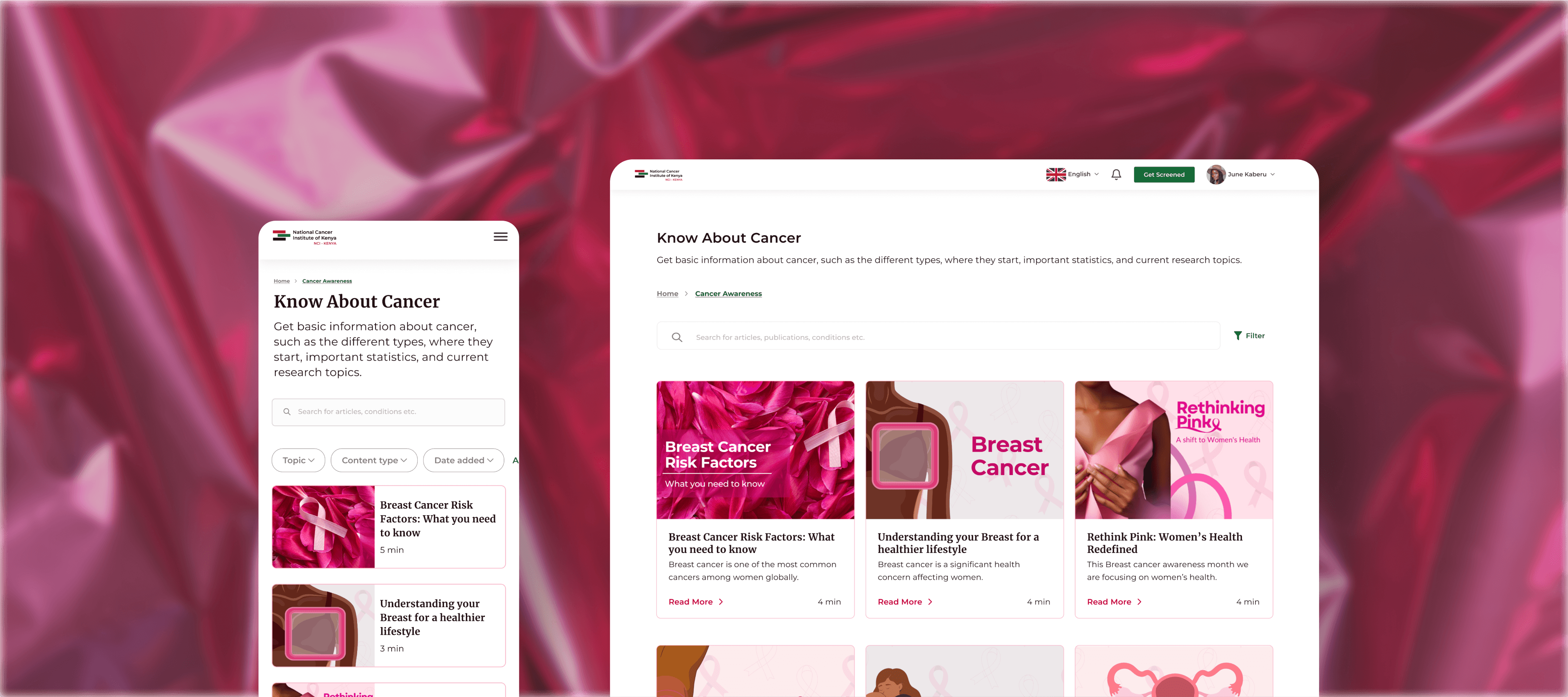
We designed the portal to enhance user experience by providing seamless access to information and tools. With a focus on simplicity, personalization, and accessibility, every feature works together to ensure users can navigate, discover, and engage with ease.

PROTOTYPE

05

Feel the experience

Feel the experience

I designed for both mobile and desktop views to make the portal accessible from any device.

I designed for both mobile and desktop views to make the portal accessible from any device.

Mobile experience

Mobile experience

Many of our users would primarily access the portal via their mobile phones. Hence, a mobile responsive version of the portal was needed.

Many of our users would primarily access the portal via their mobile phones. Hence, a mobile responsive version of the portal was needed.

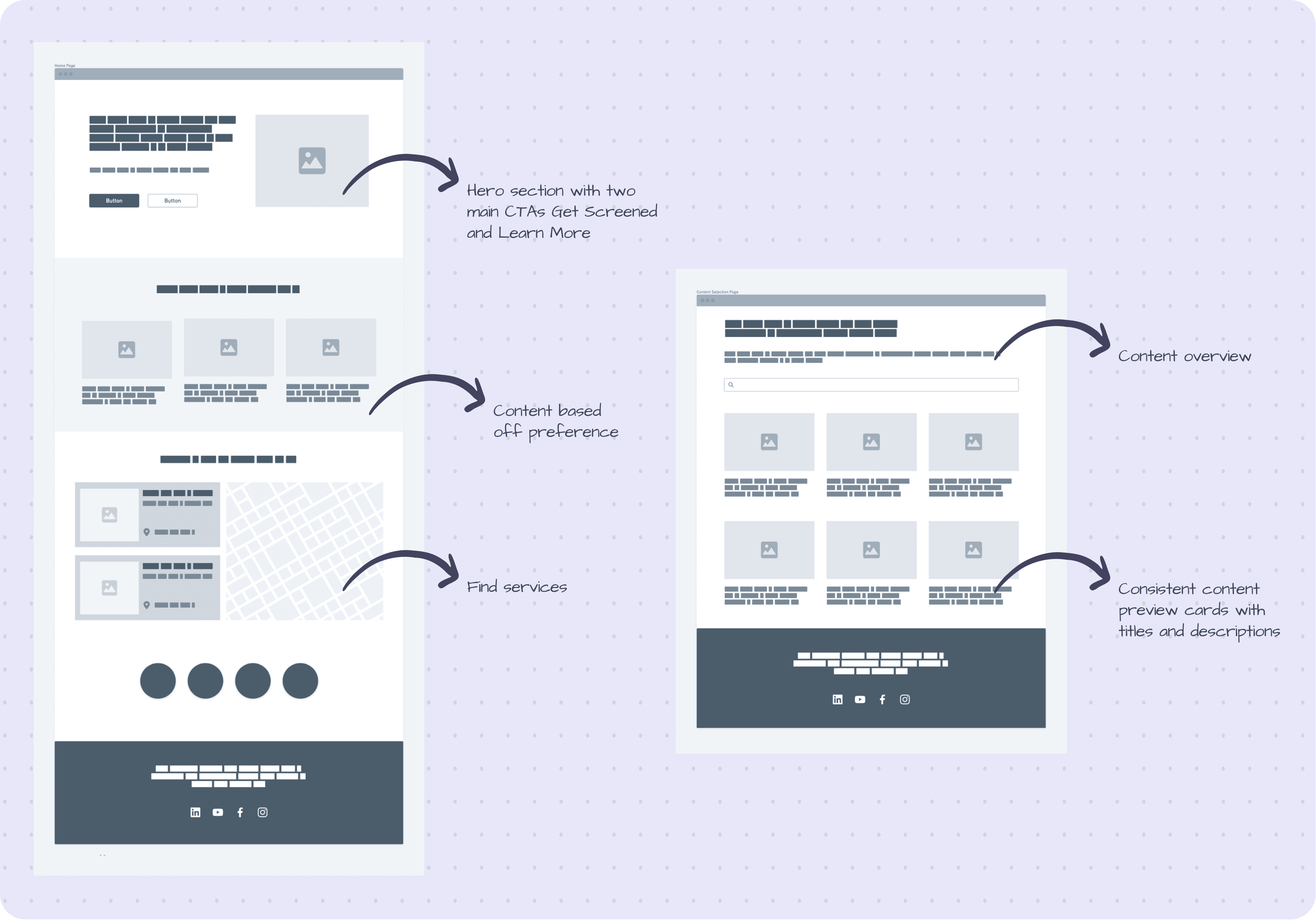
Content selection page

For the content selection page, we designed it to be easily scannable so that users can quickly browse through a variety of content.

For the content selection page, we designed it to be easily scannable so that users can quickly browse through a variety of content.

Content page

For the content page, we used a blog page style for readability.

For the content page, we used a blog page style for readability.

VALIDATION

05

After the initial release of the portal, we organised a stakeholder's validation meeting to gather feedback and insights for further improvements

After the initial release of the portal, we organised a stakeholder's validation meeting to gather feedback and insights for further improvements

  1. The portal is very effective as it can reach various strata of the community

  2. Finding cancer centres was relatively easy however, there was a mismatch between the listed locations and the actual map data

  3. The platform has limited coverage of cancer types

  1. The portal is very effective as it can reach various strata of the community

  2. Finding cancer centres was relatively easy however, there was a mismatch between the listed locations and the actual map data

  3. The platform has limited coverage of cancer types

IMPACT

05

The portal's design was an improvement from the NCI website visually and functionally

The portal's design was an improvement from the NCI website visually and functionally

Consistent Visual Language

Unlike the NCI website, the portal's design had a harmonised look

Streamlined Navigation and User Flow

It became easier for users to locate what they needed from content to facilities

Accessibility

Translation of content was made possible, with Swahili being the first

Enhanced User Experience

The portal was intuitive and easy to use